Do we understand networks?
We live most of our online life within networks of connections. Yet, some of network dynamics or properties (such as propagation, skewed degree distribution or simply network distances) can be hard to grasp based on our offline experience. Can data visualization and data design support users in their understanding of network dynamics? Can data design inform Twitter users’ perception of information reach and perhaps even increase their understanding of it? Öykü Yilmaz looked into this problem for her MSc Thesis in Software Design. Twitter is an interesting platform to study users’ understanding of network propagation due to the simple nature of Twitter’s retweets.
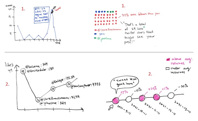
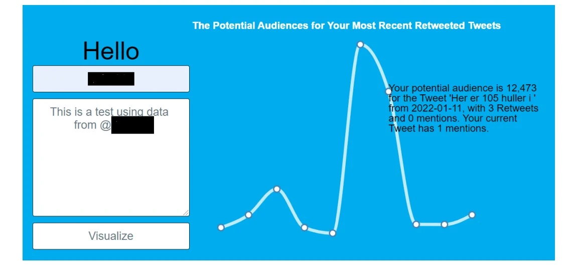
As a Twitter user, you know which users retweet, like or reply your Tweets, you might know the exact amount of impressions for your content, but you do not know how many followers your retweeter’s have, which is the potential audience of your content once it gets out out your direct network. This project used Twitter API to confront Twitter users with the potential audience of their messages before they tweeted.


This was done through a website prototype that, when provided with the Twitter username, would display a visualization of the potential audience based on users’ recent activities. The prototype was tested on Twitter users with pre-exposure surveys and follow-up interviews. The results show how the visual representation of their potential reach affects the participants’ decision about “what to tweet”. Some participants considered changing their Tweets after testing the prototype while others declared to have developed a better understanding of their possible reach. While these are preliminary results, they show how visualization tools can have a positive effect on Twitter users’ understanding of their online actions.